OneSpan Sign Developer: Designer Customization and Integration – Part 2

In the first part of this blog series, we covered how to generate a Designer session programmatically, walked through potential components on the page, and listed some advantages for using this solution during integration. This first blog provides basic knowledge regarding customization and integration with Designer Session.
In part two, we will focus on how to save your customized settings as different Designer Profiles. On top of that, we’ll also talk about how to add a banner to your Designer page and demonstrate some examples of how it can fit your workflow.
Designer Profile
In OneSpan Sign, you can define each designer customization setting as a profile.
This is extremely useful when your workflow requires more than one designer page in each scenario, and each designer page requires different settings. For example, for admin users requiring full control of the package and templates, you can use default the settings. Then for your reviewers, you can provide them with a designer profile with restricted privileges. In this scenario, they would be unable to be edit documents, but they would have a clear and easy way to browse through all the documents.
You can save multiple designer profiles at your account level by contacting our Technical Support with your profile name and descriptions of your customization.
After a profile is saved to your account, build your designer session URL to call out a specific profile as shown below:
{instance_url}/auth?senderAuthenticationToken={senderToken}&target={instance_url}/a/transaction/{packageId}/designer?profile={profileName}
The picture below illustrated the difference between a Designer profile with the default settings and one with restricted privileges. I named the second profile “minimalist”.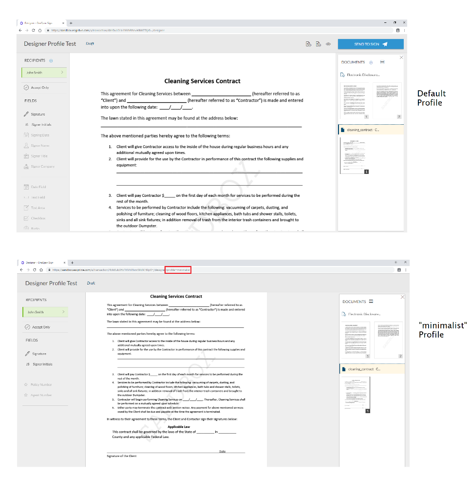
Designer Banner
In addition to the configurable components mentioned in part one, you also have the option of adding a banner to the top of the page by contacting our support team.
The image below demonstrates how this might appear.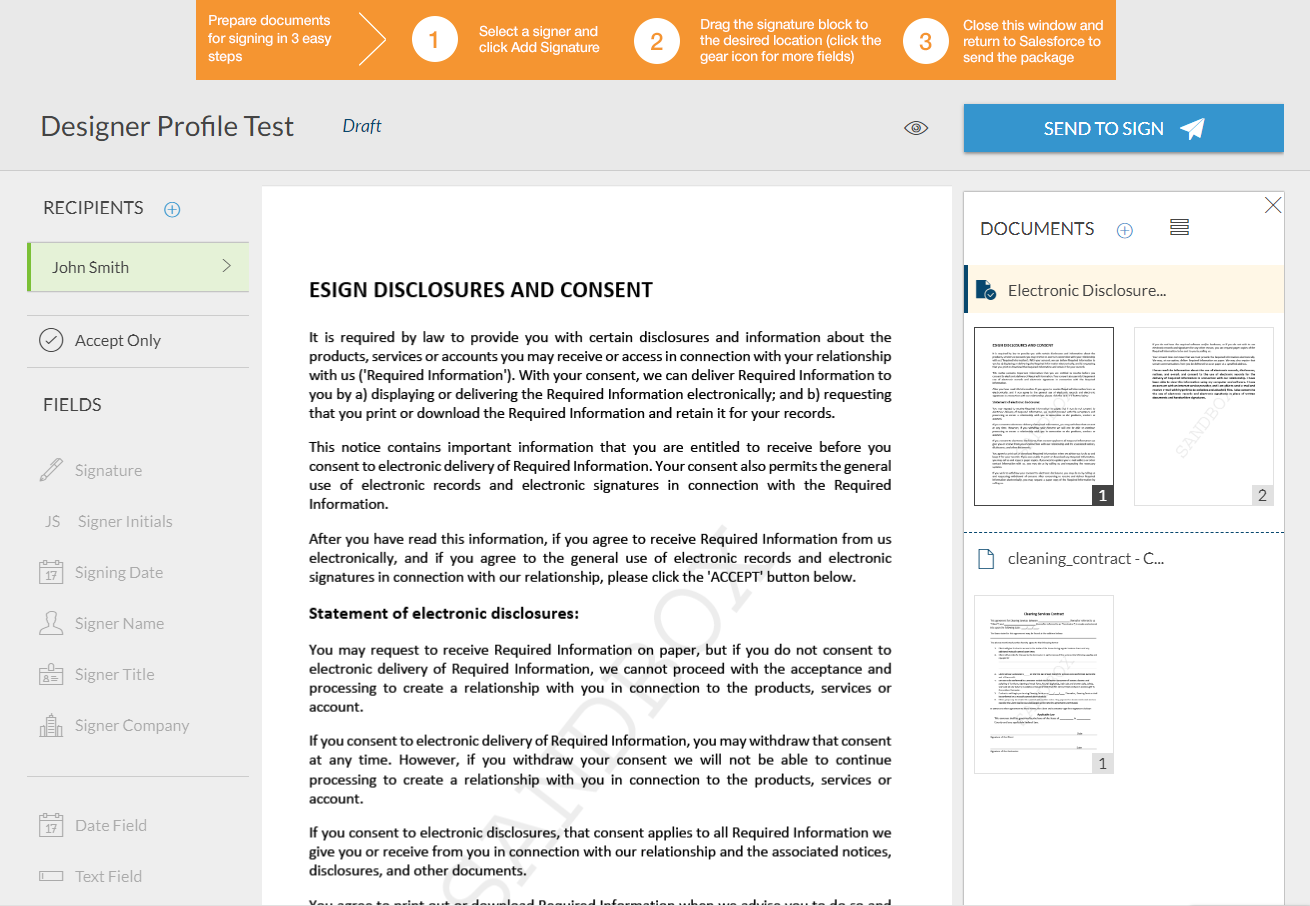
On top of your company’s logo, you can also add instructions to your end users to guide them through the steps you want them to follow. Showing the user the expected workflow simplifies the integration, especially when there are special customizations to the Designer profile.
Responsive Page
The new Designer experience is made to be responsive to optimize user experience for screens with different resolutions and different devices.
The image below shows the possible width your screen along with the corresponding content (Desktop Designer) available: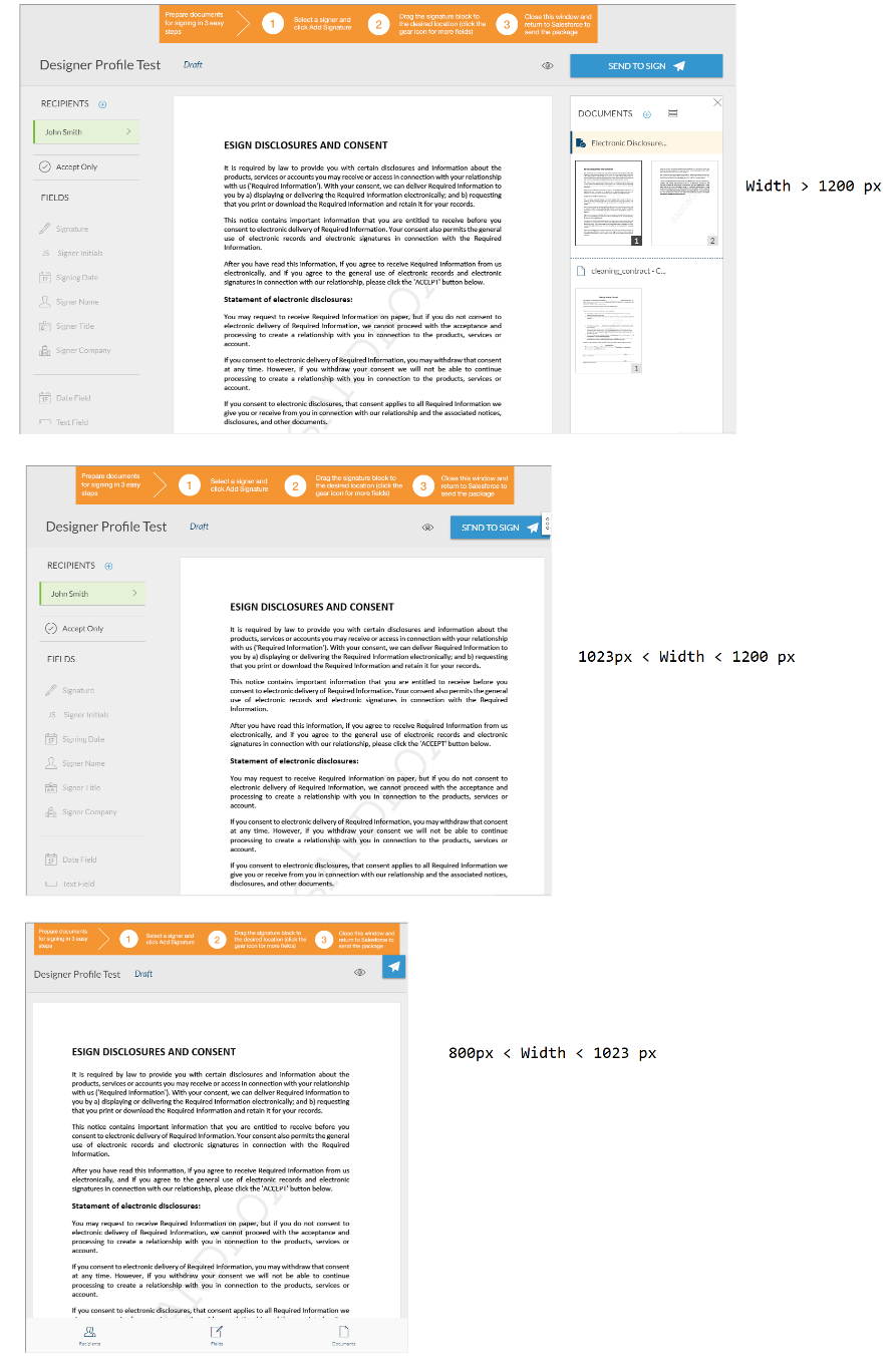
The first two images of Designer pages are perfect for document design, while the last Designer provides a clean simplified UI for document reviewers.
Note that as the minimal document image is 794 * 1028 px, your iFrame’s width is suggested to be above 800 px to avoid horizon scroll.
Through this blog, we’ve walked through the Designer Profile, Designer Banner and Designer experience with different screen widths. Each will help your Designer page and application better adapting to different scenarios.
In the third blog of this series, we will bring you some demo projects that show how to develop with a Designer page in a real development.
If you have any questions regarding this blog or anything else concerning integrating OneSpan Sign into your application, visit the Developer Community Forums. Your feedback matters to us!
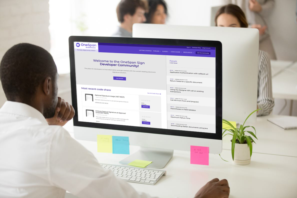
OneSpan Developer Community
Join the OneSpan Developer Community! Forums, blogs, documentation, SDK downloads, and more.
Join Today