OneSpan Sign Developer: New Signer Experience UI Message Customization – Part 1

In the first blog of our New Signer Experience series, we walked you through the updated UI components which will give your recipients a more modern and professional experience. Then in the second blog, more powerful and enhanced branding capabilities were demonstrated.
Now in this third blog, we will introduce an important part of the white labelling feature in the new signer experience: UI message customization. Due to all these behavior changes to our new UI components, we now offer different but more flexible and configurable options that allow you to customize the UI labels in the user interface.
String Customization
Note that even if you already had your string customized in previous signing ceremony, all users still have to fill in the Branding Migration forms in order to help inform our support team how you want to customize your interface.
Below I will walk you through a set of customizable UI labels. By providing the attribute names and their descriptions, together with some screenshots, you will see the effect each string customization will have. An extra “(custom content)” tag will be added after all the default values to better visually represent the white labelling capability.
In some of the UI strings, there are placeholders surrounding by curly brackets, which means these values will be dynamically injected according to your account setting. You will encounter them a few times in the example below.
COOKIE POLICY
1. "oss.components.CookieConsent.cookiePolicyTitle"
Description: Title of the cookie policy alert
2. "oss.components.CookieConsent.cookiePolicyText"
Description: Cookie policy message

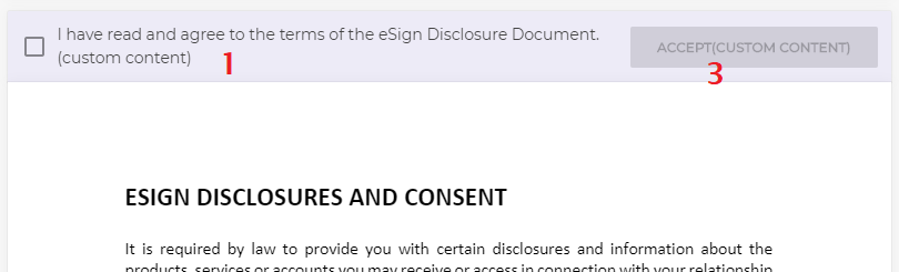
ELECTRONIC DISCLOSURE DOCUMENT
1. "oss.components.AcceptConsentBar.text"
Description: Text that appears for the e-sign Consent at the top of the page
2. "oss.components.ConfirmBar.document.consent.text"
Description: Text that appears for the e-sign Consent at the bottom of the page
3. "oss.components.AcceptConsentBar.button.label"
Description: Accept button that appears for the e-sign consent at the top/bottom of the page
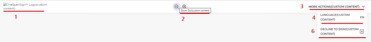
TOP BAR & MORE ACTIONS
1. "oss.components.TopBar.logo_alt"
Description: Alternative text for account logo. Used for screen readers.
2. "oss.components.ZoomButton.zoomIn"/ "oss.components.ZoomButton.zoomOut"
Description: Tooltip for zoom in/out button
3. "oss.components.MoreActions.moreActions"
Description: More Actions drop-down text
4. "oss.components.LanguagePicker.language"
Description: Language button in More Actions menu
5. "oss.components.MoreActions.zoom"
Description: Label for Zoom action in More Actions menu
6. "oss.components.MoreActions.declineTosign"
Description: Decline option within the More Actions menu
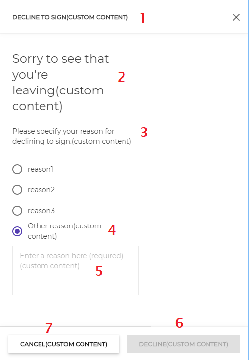
DECLINE
1. "oss.components.DeclineToSign.title"
Description: Decline pane title
2. "oss.components.DeclineToSign.contentTitle"
Description: Decline pane text
3. "oss.components.DeclineToSign.content"
Description: Text for selecting a reason to decline
4. "oss.components.DeclineToSign.otherReason"
Description: "Other reason" option
5. "oss.components.DeclineToSign.otherReasonPlaceholder"
Description: Placeholder text displayed within "Other reason" input field
6. "oss.components.DeclineToSign.decline"
Description: Decline button caption
7. "oss.components.DeclineToSign.cancel"
Description: Cancel button caption
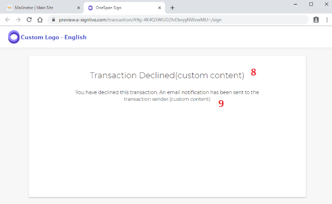
8. "oss.components.DeclineToSign.declineMessageTitle"
Description: Title of page displayed when signer declines a transaction.
9. "oss.components.DeclineToSign.declineMessageDescription"
Description: Body of page displayed when signer declines a transaction.
This page is displayed only when no handover URL is defined.
Within an iFrame accessed from the sender UI, this page will be displayed even if a handover URL is defined.
FORM FIELDS
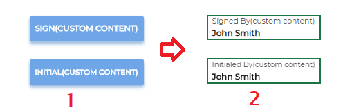
1. "oss.components.FieldsList.SignatureBlock.click_to_sign" / "oss.components.FieldsList.SignatureBlock.click_to_initial"
Description: Text displayed within Click-to-Sign or Click-to-Initial signature box before it is accepted
2. "oss.components.FieldsList.SignatureBlock.signedBy" / "oss.components.FieldsList.SignatureBlock.initialedBy"
Description: Text displayed within Click-to-Sign or Click-to-Initial signature box after it is accepted
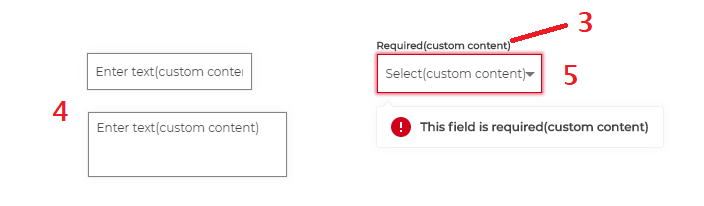
3. "oss.components.Fields.Field.required"
Description: Label displayed above a field when the field is required and is left empty
4. "oss.components.Fields.Field.placeholder"
Description: Placeholder text displayed within Text and Text Area fields
5. "oss.components.Fields.Field.List.placeholder"
Description: Placeholder text displayed within List fields
FORM FIELD VALIDATIONS
1. "oss.components.Notification.formValidationTitle"
Default Value: "Errors ( {totalErrors} )"
Description: Field Validation alert title. Displayed within the Form Validation alert.
2. "oss.components.Notification.nextError"
Description: Allows displaying the next field validation error. This is displayed within the Field Validation alert
3. "oss.components.Notification.gotoField"
Description: Allows navigating to the field with the failed validation. Displayed within the Field Validation alert
4. "oss.components.Fields.Field.requiredFieldMissing"
Description: Error displayed when a required field is missing. Displayed within the Form Validation alert and field tootlip.
5.1 "oss.components.Fields.Field.radioGroup"
Default Value: "{name} radio group"
5.2 "oss.components.Fields.Field.checkbox"
5.3 "oss.components.Fields.Field.listField"
5.4 "oss.components.Fields.Field.textField"
5.5 "oss.components.Fields.Field.textArea"
5.6 "oss.components.Fields.Field.dateField"
Description: Field type will be displayed when the field does not have a name specified, it will be concentrated with a numbered sequence (e.g. Text Area 1) Displayed within the Form Validation alert and field tooltip.
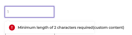
6. "oss.components.Fields.Field.maxLength" / "oss.components.Fields.Field.minLength"
Default Value: "Maximum length of {maxLength} characters exceeded" or "Minimum length of {minLength} characters required"
Description: Error displayed when the input length exceeds the maximum number or does not meet the minimum number of characters specified by the sender
7. "oss.components.Fields.Field.textField.pattern"
Description: Error displayed when the input does not match the regex format specified by the sender. Displayed within the Form Validation alert and field tooltip.

There it is. We have reviewed half of the configurable UI. Stay tuned on our ongoing New Signer Experience blog series for the rest of the UI message customization options that will be covered in next blog.
If you have any questions regarding this blog or anything else concerning integrating OneSpan Sign into your application, visit the Developer Community Forums. Your feedback matters to us!

OneSpan Developer Community
Join the OneSpan Developer Community! Forums, blogs, documentation, SDK downloads, and more.
Join Today